Docs / Viewport previews
Viewport previews
Preview your page at mobile, tablet, and desktop widths without leaving the editor.
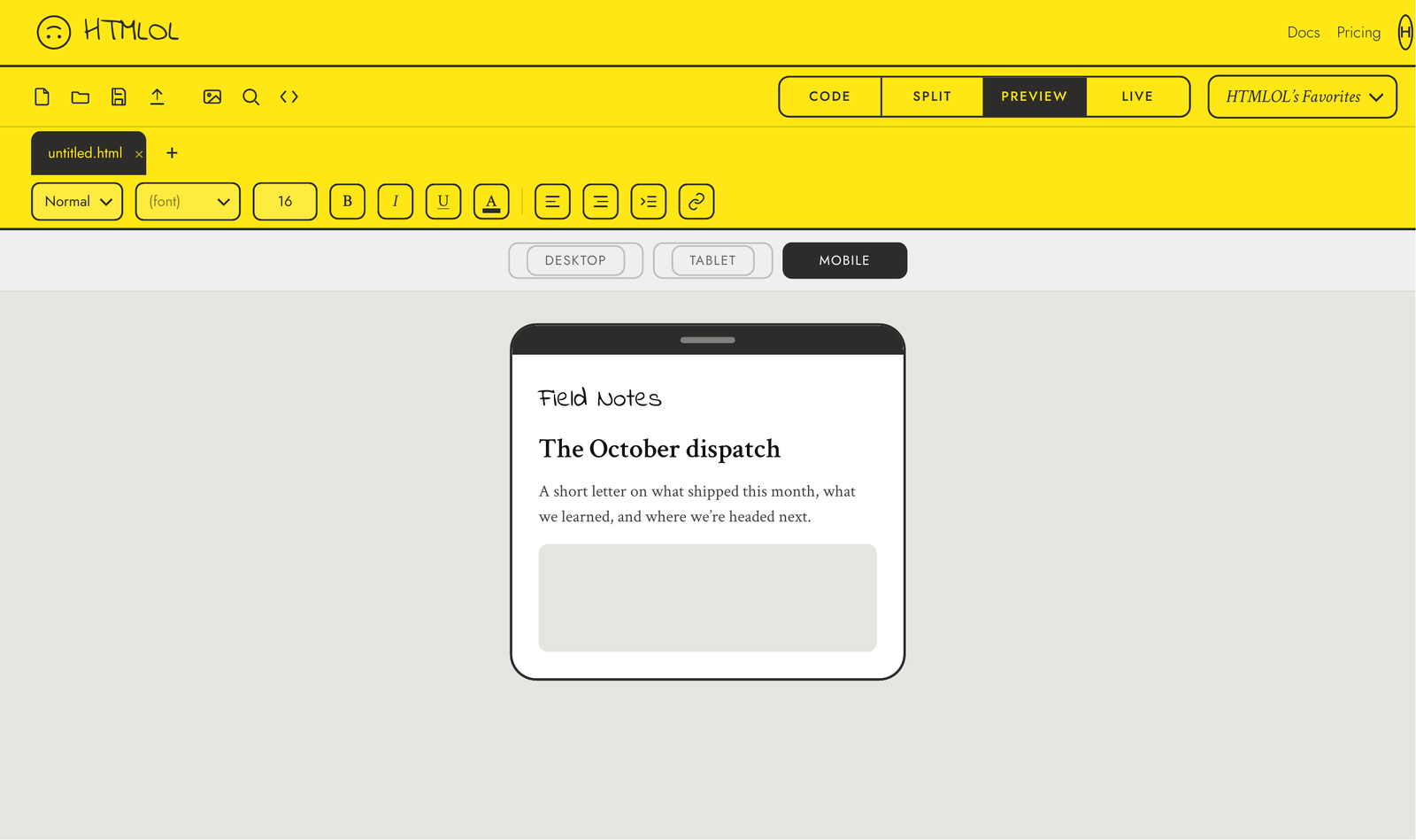
A page that looks great on a laptop can break on a phone. The viewport presets let you preview your page at common screen widths without leaving the editor.
Using the presets
In Live view, use the Mobile / Tablet / Desktop width controls to reframe the preview at that device's size. Your page reflows exactly as it would on a real screen, so you can spot text that wraps badly, images that overflow, or buttons that get too small.
Zoom
Alongside the presets, a zoom control lets you scale the preview in and out — handy for eyeballing fine details or seeing a whole long page at once.
Responsive width is about browsers. If your page is headed for an inbox, also run the compatibility checker — email clients have their own rules that screen width won't reveal.