Docs / Element panel & blocks
The Element panel & blocks
Style the selected element — type, color, alignment, links — and insert new blocks like buttons and dividers.
When you select an element in Live view, the Element panel gives you direct controls for it — no diving into the markup. It's where you set text style, color, alignment, and links, and where you insert new blocks.
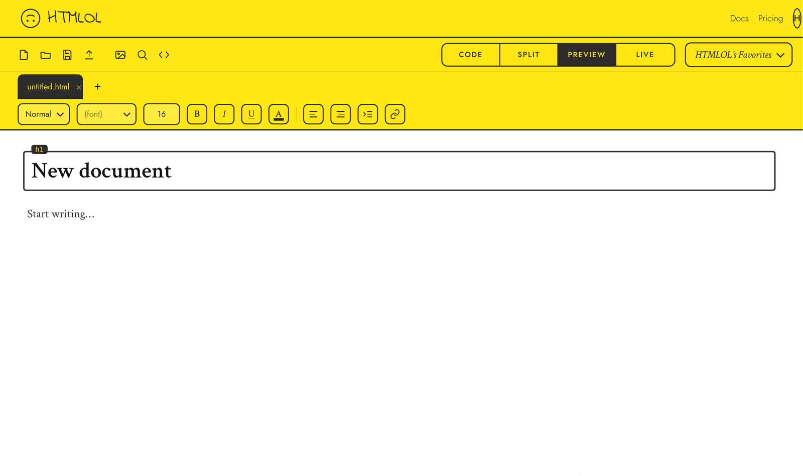
Change the text style
The type menu turns the selected text into a Title (H1), Heading (H2), Subheading (H3), Small heading (H4), normal paragraph, or Quote. Below it, B, I and U apply bold, italic and underline.
Color & alignment
The color control (A) sets text color from the active palette — if you've chosen a brand, its swatches show here. Alignment buttons push content left, center, or right.
Lists & links
Turn lines into a bulleted or numbered list, indent or outdent them, and add a link with the 🔗 button (or ⌘+K while editing text). Remove a link with unlink.
Insert blocks
Need a new element? + Button drops in a styled button and + Divider adds a horizontal rule — both inserted right after your current selection, ready to edit.
Every panel control edits the underlying HTML directly — change something here and flip to Code to see the exact markup it wrote. Nothing is hidden in a proprietary format.